Wim Crouwel
| Wim Crouwel | |
|---|---|
.jpg) Wim Crouwel (l.) receives the Willem Grollenberg Prize (1976) | |
| Born |
Willem Hendrik Crouwel 21 November 1928 Groningen, Netherlands |
| Nationality | Dutch |
| Education |
Academie Minerva Gerrit Rietveld Academie |
| Known for |
Typographer, Graphic designer |
| Notable work | New Alphabet |
| Awards |
H.N. Werkmanprijs 1958/1966 Frans Duwaerprijs 1965 Piet Zwart Prizes 1991 Anton-Stankowski-Preis 1991 BKVB Funds Oeuvre Award 2004 Gerrit Noordzij Prize 2009 |
Willem Hendrik "Wim" Crouwel (Dutch pronunciation: [ˈʋɪləm ˈɦɛndrɪk ʋɪm ˈkrʌuʋəl]; born 21 November 1928) is a Dutch graphic designer, type designer, and typographer. Between 1947 and 1949, he studied Fine Arts at Academie Minerva in Groningen, the Netherlands. In addition, he studied typography at what is now the Gerrit Rietveld Academie in Amsterdam.
Work


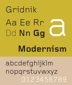
In 1963, he was one of the founders of the design studio Total Design (currently named Total Identity). From 1964 onwards, Crouwel was responsible for the design of the posters, catalogues and exhibitions of the Stedelijk Museum in Amsterdam. In 1967 he designed the typeface New Alphabet, a design that embraces the limitations of the cathode ray tube technology used by early data display screens and phototypesetting equipment, thus only containing horizontal and vertical strokes. Other typefaces from his hand are Fodor and Gridnik. In 1970 he designed the Dutch pavilion for Expo '70 (Osaka, Japan). Later, Crouwel designed the Number Postage Stamps for the Dutch PTT, well known in the Netherlands during its circulation from 1976-2002.
In the years Crouwel worked for Total Design, he designed many geometric wordmarks,[1] one of which is the wordmark for the Dutch Rabobank, designed in 1973. The lettershapes have been influenced by the fact that the wordmark had to be used as a 3D light box. After the 3D application was finalized, the 2D design for print was adapted.
According to Wim Crouwel,[2] New Alphabet was ‘over-the-top and never meant to be really used’. However, as unreadable as it was, it made a comeback in 1988 when designer Brett Wickens used a version of the font on the sleeve of Substance by Joy Division.[3]
In addition to his work as a graphic designer, he was also active in the educational field. In the 1950s he worked as a teacher at the Royal Academy for Art and Design in 's-Hertogenbosch (currently called Akademie Voor Kunst en Vormgeving St. Joost or AKV|St. Joost) and at the predecessor of what is now the Gerrit Rietveld Academie. Between 1965 and 1985 he was connected to the department of industrial design of the Delft University of Technology. From 1987 to 1993 he was extraordinary professor in the fields of History, Arts and Culture Studies at the Erasmus University Rotterdam. In the years 1985–1993 he was the director of the Museum Boijmans Van Beuningen in Rotterdam.
Crouwel's graphic work is especially well known for the use of grid-based layouts and typography that is rooted in the International Typographic Style.
Awards
- H. N. Werkman Prize (1958)
- Frans Duwaer Prize (1965)
- H. N. Werkman Prize (1966)
- Piet Zwart Prize (1991)
- Anton Stankowski Prize (1991)
- BKVB Funds Oeuvre Award (2004)
- Gerrit Noordzij Prize (2009)
Literature
- Frederike Huygen, Hugues Boekraad, Wim Crouwel: Mode en Module, 010 Publishers, Rotterdam (1997), (ISBN 90-6450-310-9), (Dutch).
- Kees Broos, Wim Crouwel: Alphabets, BIS Publishers, Amsterdam (2003), (ISBN 90-6369-037-1), (English).
- Catherine de Smet, Emmanuel Bérard, Wim Crouwel: Architectures Typographiques / Typographic Architectures, Editions F7, Paris (2007), (ISBN 978-2-916796-02-4), (French/English).
- * Kerry William Purcell, "Wim Crouwel: Modern Method", Eye Magazine, No. 79, Spring, 2011.
- Wim Crouwel 'in his own words' a selection of lectures and articles delivered by Wim Crouwel between 1973 and 2006, ISBN 978 94 90628024 Lauwen Books waysofthinking.nl
- Frederike Huygen, Wim Crouwel Modernist, Lecturis, Eindhoven (2015), (ISBN 94-6226-147-4), (English).
References
- ↑ 'Broos, K, Wim Crouwel: Alphabets, BIS Publishers, Amsterdam (2003), (ISBN 90-6369-037-1)
- ↑ Wim Crouwel on his 80th birthday (www.design.nl)
- ↑ Brett Wickens on Saville Associates
External links
| Wikimedia Commons has media related to Wim Crouwel. |
- Wim Crouwel bio at Iconofgraphics.com
- Postage stamps designed by Wim Crouwel
- Architype 3 Collection containing Crouwel's typefaces on Foundrytypes
- Definitive digital version of Gridnik on Foundrytypes
- *Kerry William Purcell, "Wim Crouwel: Modern Method", Eye Magazine, No. 79, Spring, 2011