Paul Barnes (designer)
| Paul Barnes | |
|---|---|
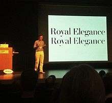
 Paul Barnes speaking on the differences between printing and carved lettering in 2013. | |
| Born |
1970 (age 45–46) Harlow, England |
| Nationality | British |
| Occupation | Graphic artist and typographer |
Paul Barnes (born 1970, Harlow, England) is a graphic designer and typographer. He has designed several new typefaces.
Career
After an education at the University of Reading, in 1992 he emigrated to the United States to work with Roger Black. In 1995 he left Roger Black and began work as a freelance designer in London. He has worked with many large corporations, making logos for such well known companies as Givenchy, ABC television and the English bands New Order, Electronic[1] and Joy Division. He has designed the very large Guardian Egyptian family typefaces for The Guardian newspaper (with Christian Schwartz).
In April 2007 he designed the logo for Kate Moss with Saville.[2]
Awards
In September 2006 he was named one of the 40 most influential designers under 40 in Wallpaper and in September 2007 The Guardian named him one of the top 50 designers in Britain. [3]
Typefaces designed by Paul Barnes
- Brunel - 1996
- Stephenson Sans - 2001
- Ironbridge - 2002
- Pagan Poetry - 2002
- Austin - 2003
- Stockholm - 2004
- Dala Floda - 2005
- Guardian Egyptian - 2005, with Christian Schwartz
- Marian - 2005
- National Trust - 2009, custom for the National Trust[4][5]
Magazine articles by Paul Barnes
- Jonathan Hoefler, Baseline 23, edited by Mike Daines & Hans Dieter Reichert, Bradbourne Publishing, 1996
External links
References
- ↑ Discogs
- ↑ CR Blog » Blog Archive » Kate Moss: The Brand
- ↑ “The top 50”, The Guardian, 1 September 2007.
- ↑ http://fontsinuse.com/typefaces/39449/national-trust
- ↑ "Type Tuesday: Reputations, Christian Schwartz & Paul Barnes". Eye. Retrieved 23 September 2016.