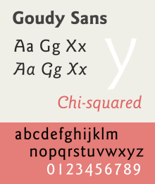
Goudy Sans
 | |
| Category | Sans-serif |
|---|---|
| Classification | Humanist |
| Designer(s) | Frederic Goudy |
| Foundry |
Lanston Monotype ITC |
| Date created | 1929 |
| Variations | ITC Goudy Sans |
| Also known as | Goudy Sans Serif |
Goudy Sans is a sans-serif typeface designed by Frederic Goudy around 1929-1931 and published by Lanston Monotype.[1][2][3]
Unlike many sans-serifs, which often have an unadorned appearance with a geometric or industrial aesthetic, Goudy Sans has a more organic and decorative structure resembling painted lettering, with reduced use of straight lines and flared stroke ends.[4][5] Goudy gave the design a "true" italic with letterforms inspired by handwriting and decorative features such as swashes and curls (some in alternate characters) inspired in part by uncial script.[6][7] This exemplifies his taste towards designs with an organic feel.[8][9][4] Goudy described the design as influenced by writing in the Greek alphabet.[10] Lewis Blackwell in 20th-Century Type describes it as "something of a sport...with pronounced tendency to the inscriptional in its 'chiselled' junctions".[11] The proportions of the lower-case are slightly condensed.[5][12]
Goudy described the design as not popular in his lifetime and did not give it a specific name; it was published as "Goudy Sans Serif" in his lifetime.[10][4][1] However, it has been re-released and digitised several times, mostly under the shortened name of Goudy Sans.
Digitisations
Goudy Sans has been digitised by P22 under its LTC imprint in a version relatively similar to the original metal type.[13] During the phototypesetting period of printing, Compugraphic developed a new version with adjusted proportions and an expanded range of weights.[14] This was re-released and expanded by ITC to form a popular four-weight version.[15][16] The ITC release was also re-released by Adobe.[17][18]
References
- 1 2 "Goudy+Sans" "New Goudy Sans Serif Announced by Lanston". Printing. 1931.
- ↑ "Lanston Monotype Machine Company announces the completion of its new Goudy Sans". Inland Printer. 87: 92. 1931.
- ↑ Printed Salesmanship. 57: 440–456. 1932. Missing or empty
|title=(help) - 1 2 3 Clair, Kate; Busic-Snyder, Cynthia (20 June 2012). A Typographic Workbook: A Primer to History, Techniques, and Artistry. John Wiley & Sons. p. 304. ISBN 978-1-118-39988-0.
- 1 2 Tam, Keith (2002). Calligraphic tendencies in the development of sanserif types in the twentieth century (PDF). Reading: University of Reading (MA thesis). pp. 31–2.
- ↑ Majoor, Martin. "My type design philosophy". Martin Majoor Type Design. Retrieved 12 June 2016.
- ↑ Majoor, Martin (Spring 2007). "Inclined to be dull". Eye. Retrieved 3 August 2015.
- ↑ Shaw, Paul. "An appreciation of Frederic W. Goudy as a type designer". Retrieved 12 July 2015.
- ↑ Sloane, Eric (April 2006). Return to Taos: Eric Sloane's Sketchbook of Roadside Americana. Courier Corporation. pp. 8–9. ISBN 978-0-486-44773-5.
- 1 2 Goudy, Frederic (1946). A Half-Century of Type Design and Typography, Volume 2. New York: The Typophiles. pp. 164–187. Retrieved 11 June 2016.
- ↑ Blackwell, Lewis (2004). 20th-Century Type. Laurence King Publishing. pp. 201–. ISBN 978-1-85669-351-6.
- ↑ Phinney, Thomas. "Twitter post". Twitter. Retrieved 12 June 2016.
ITC Goudy Sans [is] too light & narrow for 9-10 pt text
- ↑ "LTC Goudy Sans". MyFonts. LTC. Retrieved 27 August 2015.
- ↑ "ITC Goudy Sans". MyFonts. ITC. Retrieved 27 August 2015.
- ↑ "ITC Goudy Sans". Upper & Lower Case. International Typeface Corporation. 13 (1): 32–36. 1986. Retrieved 12 June 2016.
- ↑ Coles, Stephen. "Electrical Banana". Fonts in Use. Retrieved 12 June 2016.
- ↑ "Goudy Sans FS". Fontsite. Retrieved 27 August 2015.
- ↑ "Adobe ITC Goudy Sans". MyFonts. Adobe. Retrieved 27 August 2015.